

This og image generator builds the picture a link card shows when a page is shared. Choose one of 12 layouts and one of five fonts, write the text, set the background, add a logo or an image, and download the file. It works as an open graph image generator for pages that have no photo of their own, such as a blog post, a docs page, or a changelog entry.
The preview on this page is the exact file that downloads. How a platform shows it is a separate question. Facebook, LinkedIn, X, WhatsApp, Slack, Discord, and Telegram can crop, shrink, or skip the image. OG Scope is not affiliated with those products.
How to create an OG image
To create og image files on this page, work through the three tabs next to the preview: Template, Content, and Background. The preview redraws after every change.
- On the Template tab, pick one of the 12 templates.
- On the Content tab, upload a logo, an image, or both, depending on the template. The Logos template takes up to three logos.
- Choose a font: Inter, Poppins, Playfair Display, Space Grotesk, or JetBrains Mono.
- Type the tag, the title, or the description. Open the options under each field to set its size, weight, and color.
- On the Background tab, pick a gradient or a solid color, an optional grid pattern, and an optional noise texture.
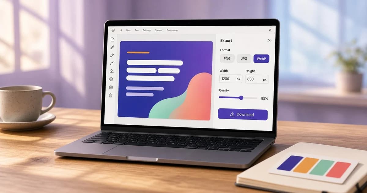
- Choose PNG, JPG, or WebP, then download the file.
Every template is 1200 × 630, the OG image size most often used for a large link preview. The OG image size tool crops an existing photo to that frame or to other sizes instead of drawing a new image.
Choosing an open graph template
Each open graph template suits a different kind of page.
- Image right puts a logo, a tag, and the title on the left and an image on the right. It suits a product page or a case study, where one screenshot explains the page.
- Basic centers a logo, a title, and a description. It suits a homepage or a docs site.
- Hero sets a tag and a large title above a wide image. It suits an article or a launch post.
- Notice pairs a logo with a title and a short line, such as a version number or a date. It suits a changelog or an announcement.
- Logos lines up to three logos above a tag and a title. It suits an integration, a partnership, or a guide that covers several tools.
- Article sets a logo at the top and a category, a large title, and a description at the bottom on a dark background. It suits a blog post or a long guide.
- Split keeps the text on the left and fills the right side, top to bottom, with an image. It suits a tool page or a product launch with a screenshot.
- Quote shows a large quotation mark, the quote as the title, and a name next to a round logo or photo. It suits a testimonial, an interview, or a talk.
- Card puts the logo, the title, and the description on a white panel over a colored background. It suits a docs page or a feature announcement.
- Spotlight fills the frame with an image under a dark shade and sets the tag and the title at the bottom. It suits an event, a place, or a case study with a strong photo.
- Minimal leaves a large title on a light grid, with a small label above it and a logo and a site name below a thin line. It suits a guide, a docs page, or any page where the title says enough.
- Browser sets the title and a short line above a browser window that shows the top of an image. It suits a web app, a landing page, or a tool with a screenshot.
Image right, Basic, Hero, Notice, and Logos are based on the open source ogimage.click templates, released under the MIT license. Article, Split, Quote, Card, Spotlight, Minimal, and Browser were made for OG Scope. Text typed in one template carries over when switching to another, along with the logo, the image, and the font.
One og image template used across a whole site keeps shared links consistent. Set the background, the font, and the logo once, then change only the title for each page. The Open Graph examples show how different page types pair a title with an image.
Fonts, text, and background options
The font menu applies one typeface to all the text in the image. Inter is a neutral sans serif and the default. Poppins is rounder and friendlier. Playfair Display is a high-contrast serif that suits editorial titles and quotes. Space Grotesk has a technical, modern look. JetBrains Mono is a monospaced font for developer content. All five are loaded from this site, so the download looks the same on any computer.
Each text field has its own size, a weight from regular to bold, and a color. A link card is often shown far smaller than 1200 pixels wide, so a large, heavy title usually stays readable better than a long, thin one. The text does not shrink on its own, so check the preview after typing a long title or switching to a wider font.
The background is either a gradient or a solid color. There are 81 gradient presets and 88 solid colors, and any color can also be set by hand. A gradient runs in one of eight directions, such as Right or Down right.
A grid, graph paper, or dot pattern can sit on top of the background. The pattern has its own color and opacity, and it fades toward the edges by the blur radius. The noise slider adds a fine grain, which can soften banding in a smooth gradient. Light text on a dark background, or dark text on a light one, keeps the title readable at a small size.
Download formats and file names
PNG keeps flat colors and small text sharp, which suits most of these designs. JPG is usually smaller and suits a design built around a photo, such as Split or Spotlight. WebP is often the smallest of the three at a similar look. JPG, PNG, and WebP are widely supported for og:image. The quality slider applies to JPG and WebP, and the file size shows next to the file name before downloading.
The file name comes from the title, the pixel size, and the format, for example how-to-fix-a-missing-link-preview-1200x630.png. A file name that changes with the title also gives each version a new URL, which helps when a platform keeps an older copy cached.
Adding the image to a page
Copy meta tags puts a set of tags on the clipboard. They name the file, its width, its height, its type, and alt text taken from the title. The address is a placeholder on example.com.
<meta property="og:image" content="https://example.com/images/how-to-fix-a-missing-link-preview-1200x630.png" />
<meta property="og:image:width" content="1200" />
<meta property="og:image:height" content="630" />
<meta property="og:image:type" content="image/png" />
<meta property="og:image:alt" content="How to Fix a Missing Link Preview" />
<meta name="twitter:card" content="summary_large_image" />
<meta name="twitter:image" content="https://example.com/images/how-to-fix-a-missing-link-preview-1200x630.png" />
Upload the file to the site, then replace the placeholder with the full https URL of the upload. A root-relative path such as /images/cover.png is a common reason a card shows no picture. The guide to OG images explains each of these tags. After the page is live, run the image URL through the OG image checker to confirm it loads and reports 1200 × 630.
What this generator does not do
This og-image generator makes one image at a time in the browser. It does not create images automatically for every page, and it does not host the files. A site with hundreds of pages usually draws its share images on the server from a fixed template. The layouts here can still serve as a reference for that design.
It also is not a social share image generator for every platform at once. One 1200 × 630 file can fit most large cards, and each platform still decides how to frame the picture.
When the image is published, paste the page URL into the Open Graph checker to see which og:image it reads and the estimated cards built from the tags.